Bad UX Is Technical Debt
The ellipsis was the bug
The first thing I noticed was the ….
I'd been brought onto a governance SaaS — the kind of product compliance teams live inside all day. Their job is to read law: GDPR, and a stack of other regulations just as long. The application presented each document as a treeview. Every clause was a node — 1.1, 1.1.2, 1.1.2.1 — nested as deep as the law went. Click a node, and a panel slid open on the right to show you that paragraph.
And every single row ended in an ellipsis.
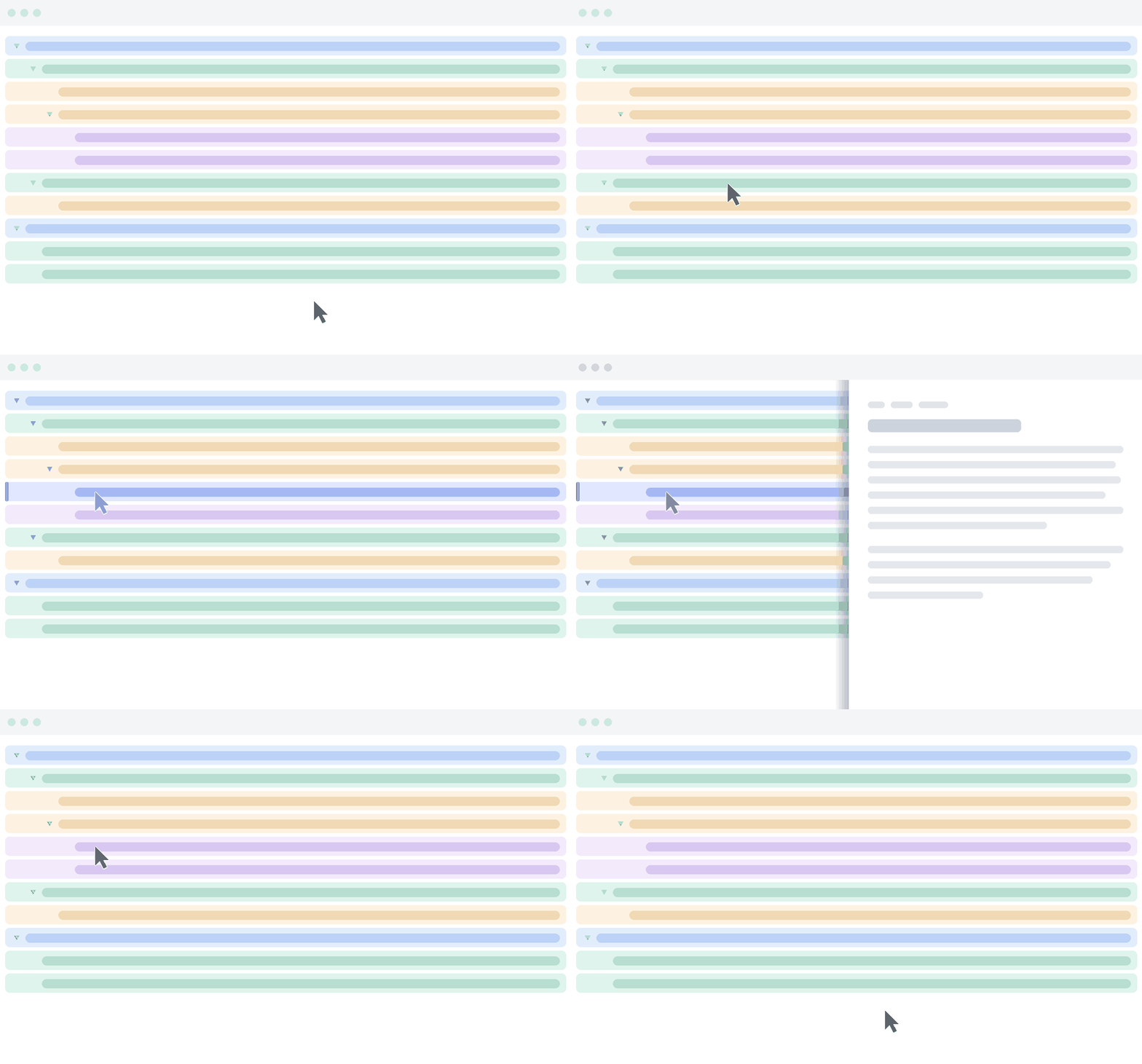
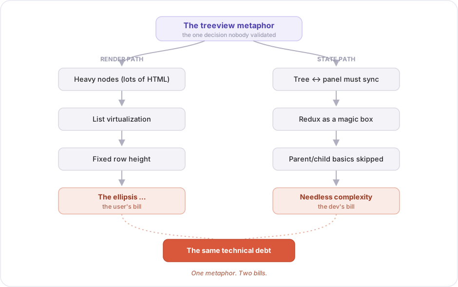
That little … looked like a styling detail. A line of CSS someone would clean up eventually. It wasn't. It was the visible tip of a decision that had quietly bent the entire codebase out of shape — and by the time I arrived, two different teams were paying for it without realizing they were paying the same bill.
"Design is not just what it looks like and feels like. Design is how it works."
— Steve Jobs, in the 2003 profile "The Guts of a New Machine"
That line usually defends a prettier button. Read it the other way and it's a warning to engineers: a design that fights the user will, sooner or later, surface as something that fights you. This is the story of where it surfaced.
The user's bill
Start with the person in the chair.
A compliance officer doesn't browse a regulation. They read it. They pull up a clause, check whether the company is in line with it, and cite it in a report. Reading, checking, referencing — that's the whole job.
Now picture doing that job through this interface. Every clause is a one-line stub, truncated mid-sentence. To actually read one, you click it and wait for the side panel. You read the panel. The clause you're comparing against is three nodes up — so you click that, and now the first one's gone. You're ping-ponging between a tree of unreadable stubs and a panel that only ever holds one paragraph at a time. The law is a continuous text, and the product had chopped it into a thousand tooltips.
The users weren't mad about the ellipsis. They were exhausted by it. They'd quietly started keeping the actual PDF open in another tab.
The dev's bill
Here's where it gets interesting, because the developers had a completely different complaint — and they didn't know it was the same one.
Heavy nodes, fixed rows
The nodes were heavy. Each clause carried a lot of markup — numbering, formatting, status badges, the works. Render a whole regulation's worth of those at once and the page crawled. So the team did the responsible-sounding thing: they reached for list virtualization. Only render the rows in view; recycle the rest as you scroll. Standard move.
But virtualization has a price. To know where every row goes without measuring it, the windowing needs fixed row heights. Every row has to be exactly the same size. And the moment a row is a fixed height, a long legal clause can't fit — so you truncate it. With an ellipsis.
The ellipsis wasn't a design choice that hurt the UX. It was a technical compromise that surfaced as UX. The performance fix leaked upward and became the user's daily friction.
The magic box
Then there was the store. And here's the thing worth slowing down on: Redux wasn't the villain — how they used it was. The screen was split into a tree and a panel, and those two needed to share exactly one thing: which clause is selected. A small, ordinary problem. Two components, one piece of shared data.
Instead of solving it small, the team made Redux the magic box that every interaction passed through — every click, every expand, every scroll round-tripping through one global store. And in reaching for that store every single time, they skipped the most basic move in front-end work: a parent component hands data down to its children, and a child hands events back up. That boring little handshake was all the tree and the panel needed to stay in sync. Forced through a global store instead, a one-line hand-off ballooned into actions, reducers, and slices nobody could hold in their head. Complex, for nothing.
So: an exhausted user on one side, an unmaintainable store on the other. Two bills. One root cause.
The root cause
Nobody had ever asked whether a tree was the right shape for reading a law. The treeview was simply inherited — that's how legal documents are structured, isn't it? — and never once validated against the person who had to use it. That single unexamined decision forced the virtualization, which forced the fixed heights, which forced the ellipsis. And it split the screen into a tree and a panel — the very seam the team then drowned in Redux.
The metaphor was the original sin. Everything else was interest.
The wrong question
When I picked it up, the backlog was full of what. Make the rows expandable. Make the panel wider. Add a tooltip with the full text. Virtualize the panel too. Every ticket was a patch on the treeview, and every patch would have made the store worse.
I didn't touch any of them. I went to talk to the product owner instead — and I tried hard not to ask about features.
I ignored the what. I went looking for the why, so I could guess the how.
Asking what people actually do
The question that turned the whole thing was almost embarrassingly basic:
"Walk me through what one of your users actually does with a document. Not in the app — in their job."
The PO didn't say "they navigate the tree." Nobody ever says that. They said: they open the regulation, find the relevant article, read it top to bottom, cross-reference it against an internal policy, and quote it in an audit note.
Read it. Top to bottom. Cross-reference. Quote.
Not one of those verbs is "browse a hierarchy." The users were trying to read a document like a PDF, and we'd handed them a file explorer. The treeview wasn't solving their problem; it was a structure we'd projected onto their problem because the data happened to be hierarchical.
The reading view
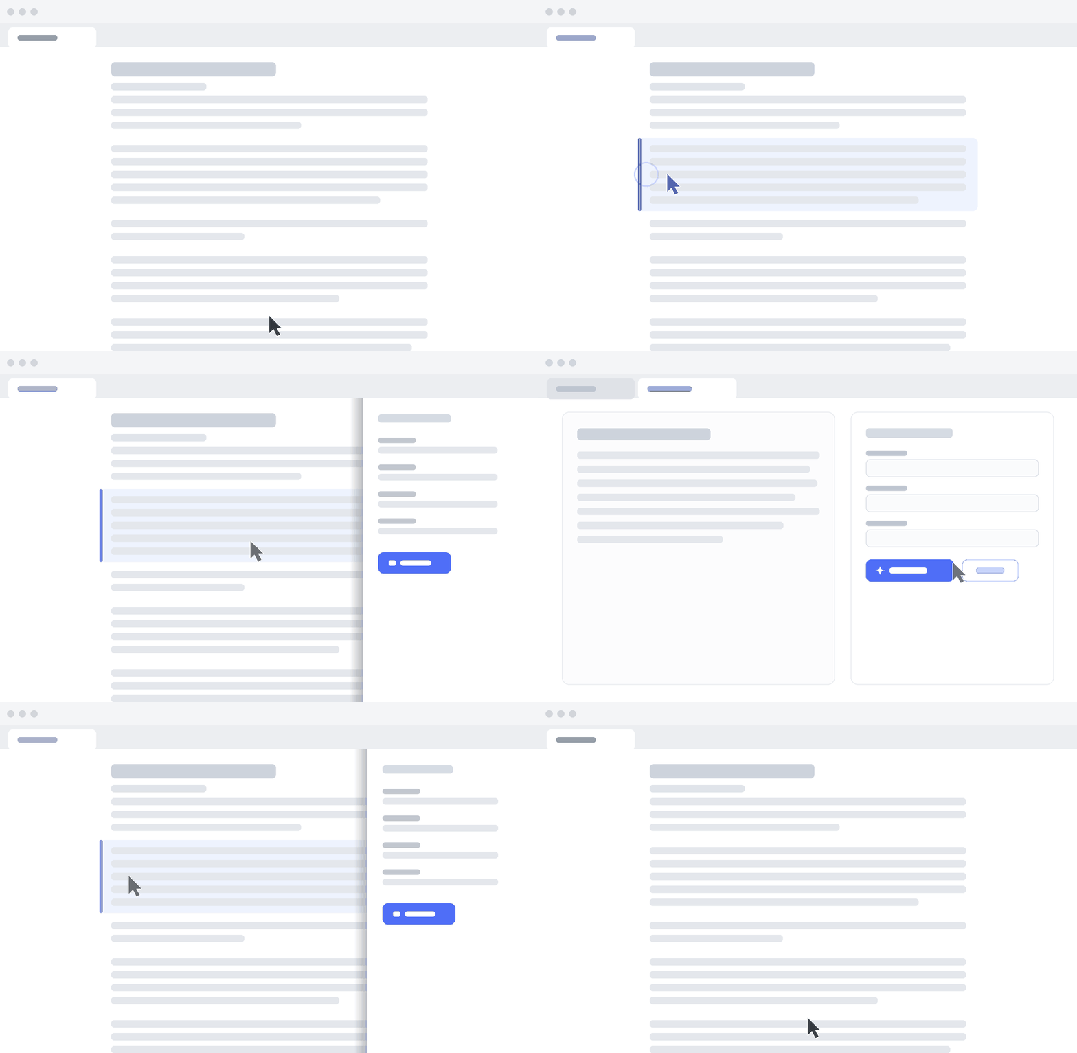
Once you see the task as reading, the design almost writes itself. You don't render the whole law at once — you render the section the user is reading, as continuous, full-width text. A breadcrumb shows where they are; navigation moves them between sections; the current clause lives in the URL, so it's linkable and survives a refresh.
What disappears
And look at what quietly dies in that design.
If you only render the current section, there's no thousand-node tree to keep fast — so there's no virtualization. No virtualization means no fixed row height. No fixed height means no ellipsis. The thing the users hated didn't get fixed; it ceased to have a reason to exist.
The same goes for the store. Reading collapses the tree-and-panel split into one continuous view, so there's nothing left to keep in sync. "Which clause am I on" is just the URL. The rest of what had piled into Redux was never really global to begin with — plain props and callbacks carry it. The magic box was gone, and nothing missed it.
I made the tree unnecessary
I knew the engineers in the room wouldn't take "it reads nicer" as an answer, and they shouldn't have. So at the sprint review I led with the objection myself: Haven't you just moved the performance problem? A regulation is huge. Render it as one long document and you'll choke on a big one. And without the tree, how does anyone find clause 1.1.2.3.1?
Fair questions. So I'd benchmarked against the worst case the company actually had — their longest document in production, not a toy. Old treeview versus new reading view, side by side, rendering live in front of the stakeholders.
The reading view won. Not because I'd out-optimized the virtualization — because I never needed it. You only ever paint the section in view; the length of the whole regulation is irrelevant to the render. The old design had to work hard to make a thousand nodes cheap. The new one never created the thousand nodes.
That's the sentence I wanted the engineers to leave with:
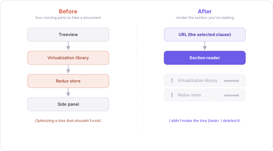
I didn't make the tree faster. I made the tree unnecessary.
Deleting, not optimizing
The most senior thing I did on that project wasn't writing clever code. It was deleting it. The virtualization library — gone. The Redux store — gone. Fewer components, simpler data loading, a smaller bundle, and a navigation that finds 1.1.2.3.1 through a breadcrumb and a deep link. Less code, doing more, and the users finally got to read.
"The best code is no code at all. Every new line of code you willingly bring into the world is code that has to be debugged, code that has to be read and understood."
— Jeff Atwood, Coding Horror
The virtualization and the magic-box store were both code written to prop up a UI that shouldn't have existed. The best version of that code was the version I deleted.
Bad UX is technical debt
Here's the part I keep coming back to.
The exhausted compliance officer and the engineer drowning in reducers were filing complaints to two different teams. Design heard "the app is frustrating to read." Engineering heard "the state management is unmaintainable." They sound like unrelated problems. They were the same debt, billed to two departments — and both invoices traced back to one UI metaphor nobody had questioned.
That's the whole lesson, and it's why I'd argue this to any developer who thinks UX is the designer's department:
A UI that fights the user doesn't just annoy them. It forces the code to contort around it.
UX is architecture
A bad interaction model doesn't stay in the interface. It seeps into your data fetching, your state shape, your component boundaries, the libraries you're forced to adopt to prop the whole thing up. UX decisions are architecture decisions — you just don't get to see the architecture bill until much later, after it's compounded.
Conway's Law says a system's structure ends up mirroring the organization that built it. There's a version for interfaces: your code ends up mirroring the interaction model you commit to. Choose "navigate a tree of everything" and you grow a tree-shaped codebase — virtualization, selection stores, sync flags. Choose "read a document" and you grow a far smaller one. The metaphor isn't downstream of the architecture; it is the architecture, decided the moment someone drew the first screen.
Start from a UI metaphor and the code rots around it. Start from the user's real why and the architecture falls out clean. The cheapest refactor I ever shipped, I shipped by asking what someone actually did with a document — before a single line was written to support the answer I'd assumed.